There are a ton of data wrangling tools out there. But no one is asking the fundamental question – is bigger data always better?
Big Data promises a lot. Businesses are salivating at all the opportunities and insights locked inside data – data from wearable devices, smart homes, social media, mobile apps, server logs, medical devices, the list goes on. It’s never been so easy to capture, store and process all that data. Promising startups like Trifacta, Platfora, Waterline Data, and open source ETL tools like Airflow and Luigi are addressing the initial hurdle – automating the data prep phase – allowing data scientists to spend more time on analyses.
What I don’t see people paying attention to is what happens after we solve the data wrangling problem. Do we automatically find the pot of gold at the end of the rainbow?
No.
Let’s hang on to our critical thinking hats for a bit, and look at a couple of ways how large amounts of data can lead us astray. Even if we have all the tools and processing power in the world.
Gremlins in the Wild
Finding Patterns In The Noise
“Torture the data long enough, and it will confess to anything.”
– Ronald Coase, Nobel Prize Winning Economist

Charles Darwin in the cloud? A message from above, or random chance?
The human brain is a pattern finding machine – it is deeply rooted in our survival instincts. So much so that we find patterns in random noise. And we’ve known this for a long time. Nobel Prize winning economist Ronald Coase made his memorable observation in the sixties. Scott Adams has Dogbert bragging about increased sales to left handed squirrels in 2000. And this problem gets worse with more data – if we are not careful, we are much more likely to find bogus relationships than meaningful ones.
“Finding patterns is easy in any kind of data-rich environment; that’s what mediocre gamblers do. The key is in determining whether the patterns represent noise or signal.”
– Nate Silver
As Nate Silver explains in “The Signal and The Noise“, the number of meaningful relationships in data that explain cause and effect – the signal – is orders of magnitude lower than the amount of data we now collect. We are much more likely to find red herrings if we indiscriminately mine data for patterns.
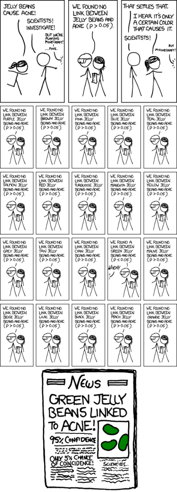
Stock markets are a prime example of an area where people desperately want to find patterns. High frequency trading and highly liquid global markets have removed all low hanging fruit, so what’s left is just noise, or is fundamentally unpredictable. The xkcd comic about green jelly beans causing acne looks so absurd – no one would possibly do something like that, right? But it’s not so different from what these “researchers” did, mining Google Trends for keywords that “predict” stock market movements. When algorithmic traders tried to replicate the study, they failed miserably.
Hidden Bias
Even though we collect a tremendous amount of data today, it’s still just a sample of all the data in the universe. A very large sample. And a sample that could be biased.
“If you’re using a biased instrument, it doesn’t matter how many measurements you take. You’re aiming at the wrong target.”
– Nate Silver

A classic example of data collection bias is The Literary Digest Presidential Poll of 1936 – showing Governor Landon of Kansas winning the election by an overwhelming margin. The magazine polled 10 million voters, of whom 2.4 million responded. That was surely Big Data for that era! However Landon won only Vermont and Maine; President Roosevelt carried all other states. What went wrong?
The problem was with how The Literary Digest chose its data. It polled 10 million of its own subscribers, along with registered automobile owners and telephone users. And this was during the Great Depression! People who could afford magazine subscriptions, cars and telephones were very different from the average voter. No wonder they got such a biased response.
Meanwhile, George Gallup correctly predicted the winner using a much smaller, but unbiased sample of 50,000, and shot to national fame.

A more recent example is the failure of Google Flu Trends. When it initially launched in 2008, Google was able to predict the incidence of flu by geography a full two weeks before the CDC, based on the number of flu related searches from that region. But in 2011-2013, their model broke down. They overestimated actual flu levels by a factor of two! Turned out that large numbers of healthy people were searching for flu related information – a side effect of the increased media coverage during those years.
So What Do We Do?
The solution here is to make sure we understand the context of our data. We need to ask ourselves:
- Are we using data sources with the highest signal to noise ratio?
- Do we understand the processes that produced our data?
- Have we identified sources of measurement error?
- What are possible sources of bias?
- Why do we think our data should have a predictive effect?
- Do we have ways of reproducing the effect on entirely new samples of the data?
If we do this exercise before we start data mining, we can make truly data informed decisions while avoiding embarrassing mistakes.
